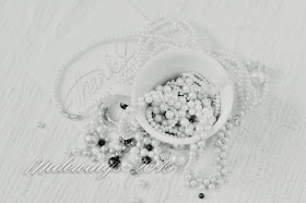
Be Still 52, Still Life Photography Class, week #3.
Kim Klassen's class on Still Life this year is a self paced class.
I am taking it as a challenge because Still Life has never ever been something I was terribly interested in, so I find this challenging and pretty exciting too.
The shot above is more often what I like in Still Life. Or if you want to call it, "Skull Life" that is okay too.
I used a black t-shirt as a back drop and a black poster board to arrange the skulls on.
I used a dresser as my 'table top'. I wanted an all black back-round to go with the skulls.
The skull in the back is a doe skull. The ones on each side of the painted skull are ground hog skulls. The painted one is a raccoon skull.
What can I say? Animals fascinate me.
So to go from that to this:
Is pretty challenging!
Here was my 'studio' set up.
Note the camera assistant inspecting the items on the floor in front of his crate.
Also note, the house is currently getting prepared for a major remodel so we have throw rugs on the area where we took out bricks [sigh, they would have made an interesting back drop!].
During the series of shots with ambient light coming through the window, I had a hedgehog toy come flying into the foam board and knock it over.
I'm sure Morris was just trying to see what would happen if we didn't bounce a bit of light.
He assisted by hitting the cup and bouncing beads all over. I call it 'dog art'. It ended up being a nice random pattern so I left it that way.
Materials used. Old white rug. White foam board. Nikon D5200. Tripod.
50mm Nikkor lens [great lens, fast!] Plastic beads in multi colors, fake pearl necklaces, a pair of earrings, and old coffee cup, and a Thank You card from my oldest son's wife. I had no idea why I kept it, but it really served a purpose here.
I took many shots, including one with a silk scarf that I really liked.
But then I had to see how it would look in Black and White.
Eh...so so... but I liked it.
Then I tried using black and white but adding a yellow tinted filter with CorelAfterShotPro.
Better, but it needs a crop at the top like I did with the color version.
Yet I wanted to try some other ideas. I wanted to do High Key!
Well that did not work!
Onward, how about another angle?
For some reason I really like the color in this. The cup has a rather neat pattern that lends itself to this shot. The rug adds just enough texture to be interesting, I think.
But, it still wasn't quite what I was looking for.
I settled on the first shot as my final.

Today I may head down to a junk shop and browse for some more interesting things for more still life photos.
As I fell asleep last night I had a few ideas that included a couple of toys.
Hmmm.


No comments:
Post a Comment
Please include at least your first name if you are commenting Anonymously. Thank you.